Enabling scale with the Beerwulf design system
Year.
2022
Role.
Lead Product Designer
Tasks.
- Researched and analysed best practices for design systems
- Gathered stakeholder requirements to align system goals
- Conducted a UX audit of the Beerwulf webshop
- Evaluated and restructured the Figma component library
- Created and updated components to improve consistency and scalability
- Documented usage guidelines, copy standards, component behaviors, and interactions
- Led the adoption and implementation of the design system across teams
Overview
Inconsistent design patterns across digital products lead to user confusion, reduced trust, and fragmented experiences, making it difficult for customers to achieve their goals efficiently. Without a design system in place, teams struggle to maintain visual and functional consistency, slowing down development and compromising user satisfaction. A robust design system is essential to create seamless, cohesive, and user-friendly interactions across all touchpoints.
Below I outline how I developed a comprehensive design system for Beerwulf, a growing scale-up. As the organisation expanded, establishing a unified and efficient design framework became critical to maintaining brand consistency, scalability, and a seamless customer experience.
Why the Design System Was Essential
The design system solved critical challenges, including:
- Scalability
A single designer couldn’t efficiently manage multiple projects without reusable components. - Lack of Documentation
There were no records detailing the rationale behind previous design choices. - Development Inefficiencies
Redundant components and "style bloat" complicated front-end maintenance. - Brand & Content Challenges
Inconsistent guidelines led to fragmented branding and content workflow inefficiencies. - Business Continuity Risks
Key knowledge relied on individuals, risking loss when team members left.
Project goals
- Establish Design Principles
Create clear brand and tone-of-voice guidelines for all stakeholders to maintain consistency. - Design-led Documentation
Provide designers and developers with comprehensive component usage and interaction patterns. - Streamline Processes
Enable efficient design output to address resource limitations.
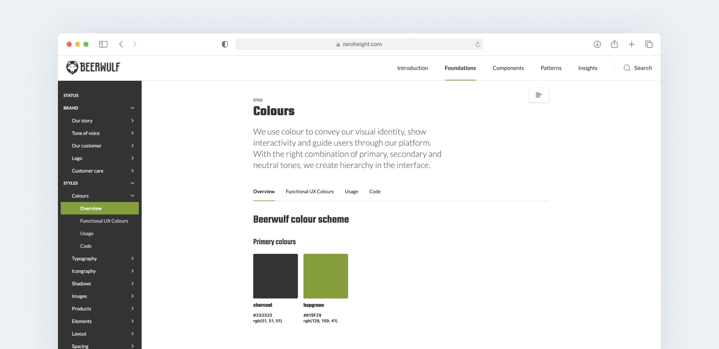
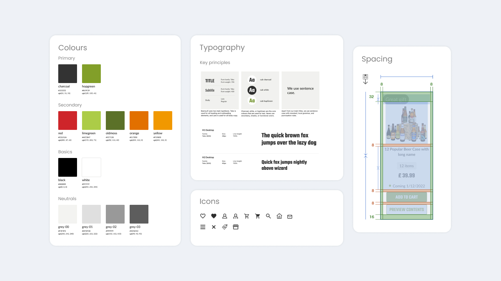
Brand guidelines
The design system was built on a solid foundation, starting with a centralised repository of brand and style guidelines. This documentation served as a single source of truth, ensuring consistency across teams, including marketing, external advertising agencies, content managers, product designers, and engineers. By establishing clear guidelines, the system facilitated seamless collaboration and maintained brand integrity across all touchpoints.
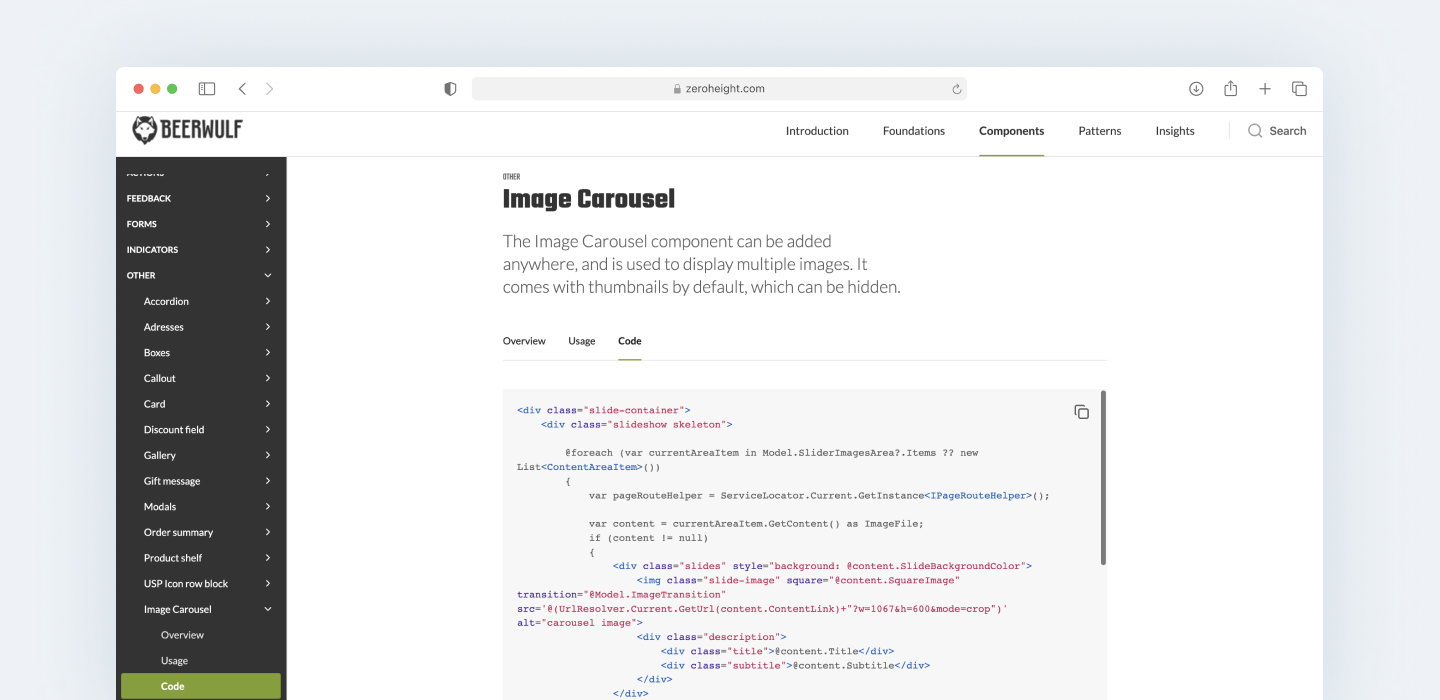
Development
Software engineers required a structured approach to managing and maintaining code across teams. The design system addressed this need by providing a dedicated repository for shared components. I collaborated closely with development teams to integrate code and ensure each component was thoroughly documented. This included detailed specifications, usage guidelines, states, and user interactions, enabling engineers to implement components efficiently and consistently.
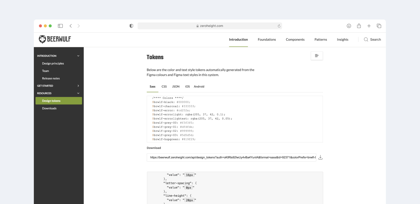
Design tokens
I began by defining design tokens as variables within our Figma environment, creating a scalable foundation for consistent styling. Collaborating closely with development, I ensured these tokens were implemented in the front-end code, maintaining visual consistency across the product. This groundwork proved essential as new sub-brand themes were later introduced, allowing for seamless adaptation without compromising design integrity.
Documentation
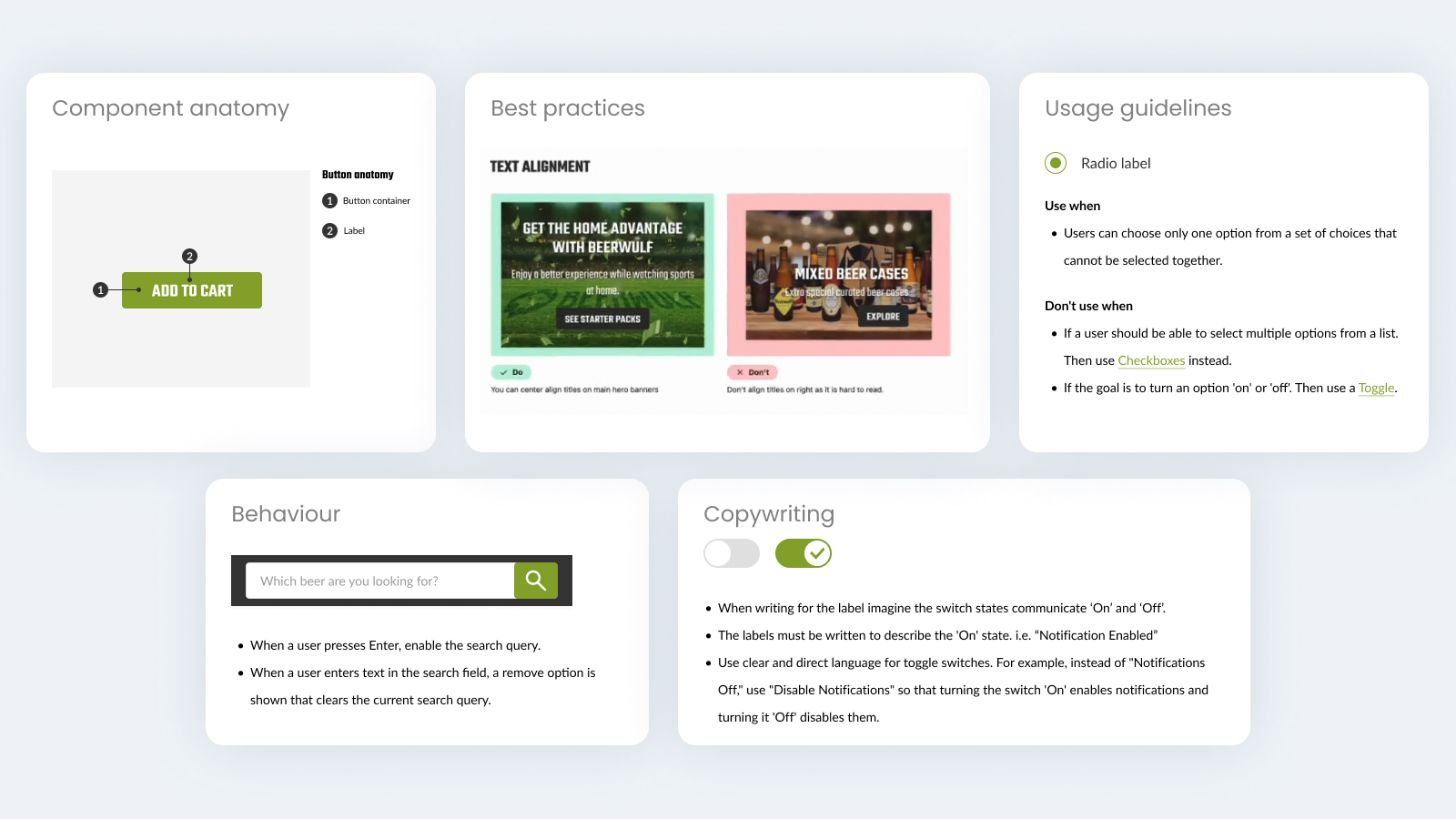
A critical part of the design system was ensuring comprehensive documentation to support teams in using components effectively and consistently. I created in-depth documentation covering component anatomy, usage guidelines, best practices, expected behaviours and interactions, as well as copywriting guidance. This became a go-to resource for both designers and developers, streamlining collaboration and reducing repeated questions or inconsistencies. It played a key role in ensuring alignment across teams and maintaining a high standard of implementation.
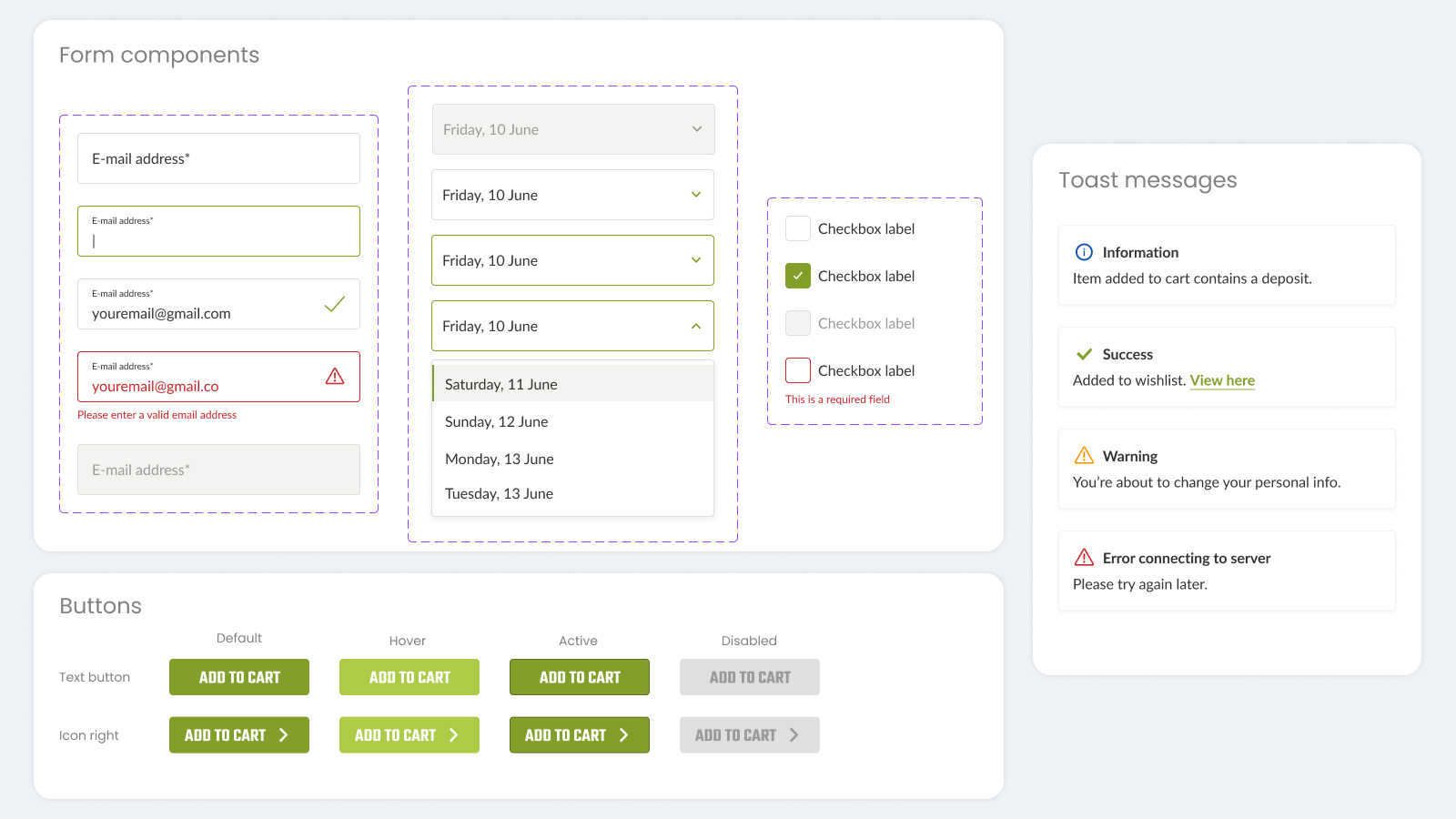
Components and styles
The existing Figma style and component library was fragmented and disorganised. I improved component layout by introducing the 8 point grid system, streamlined its structure and improved maintenance, ensuring consistency across both existing and new components. This significantly enhanced efficiency in my design process and benefited my design, UX, and CRO colleagues by enabling a more seamless workflow.
Business impact
The design system delivered significant improvements:
- Enhanced Efficiency
- Increased efficiency and workflow between UX, Product and CRO teams.
- Faster onboarding and easier page-building for content specialists using reusable components.
- Introduction of design tokens to development process.
- Improved Collaboration
Strengthened communication and handoff between design and development teams. - Optimised Processes
Documented validation and experimentation results within the design system, driving confident decision-making and improved conversions. - Scalable Framework
Created a foundation for consistent and efficient UI/UX development across teams and projects.
Conclusion
The design system not only resolved existing challenges but also established a scalable and robust foundation for Beerwulf’s continued growth. By addressing design, development, and content inefficiencies, it enabled the team to focus on creating exceptional customer experiences.