Information Architecture: Improving our Navigation Experience
Year.
2023
Role.
Product Designer
Tasks.
- Competitor & User Research
- Information Architecture
- UI Design
- Usability Prototyping
- Documentation
- UAT for go-live
Overview
This project involved a complete overhaul of the UI and UX of our desktop navigation. With business requirements and marketplace growth, the need for improved navigation became increasingly important.
“As a general rule, UX practitioners are recommending about 7 links to include within the primary navigation. Less is more.
The Process
- Restructured the primary navigation links to include only those most important with the highest business value.
- Reorganised the subcategories within each parent category to help guide users along their journey.
- Improved our UI styling to give the navigation look and feel a refresh.
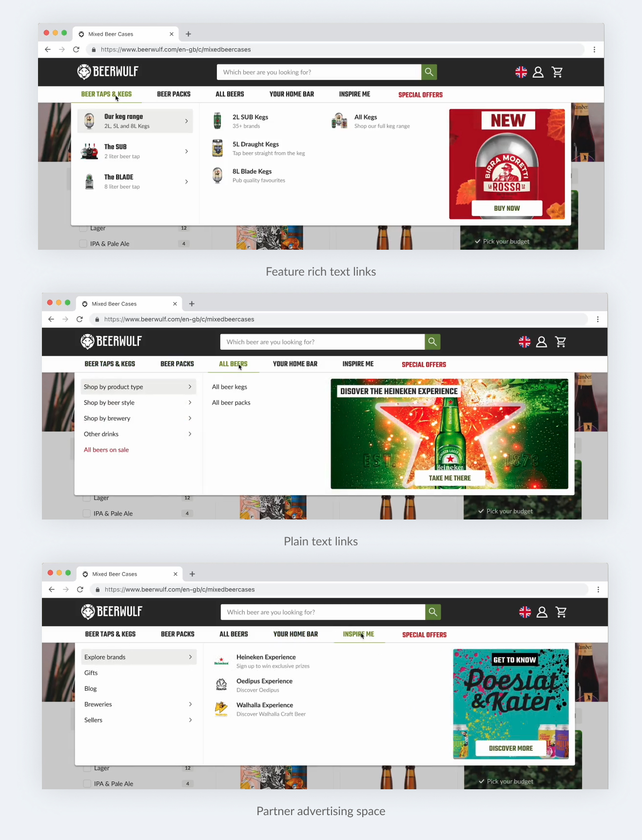
- Introduced a combination of two link types, plain text and feature rich which allows content specialists to add a thumbnail, heading and sub-text to give context and enhance the understanding of some of our more complex products.
Our previous navigation showed all categories all at once, making it more challenging to process the information presented to them. When restructuring the categories within our navigation, I applied the principle of Hick's Law using progressive disclosure to only reveal content which the user is actively interested in.
When a user hovers over a link in the primary navigation, such as "Beer Taps & Kegs," the first child element automatically opens, displaying links relevant to that subcategory. As the user explores other subcategories, the same behavior persists, making it easier to navigate and find their desired destination.
Usability testing
The prototype which was built for new menu structure was used to conduct extensive usability tests ensuring that the new structure and flow was still familiar and usable to our current customer base.
Business Value: Marketing as a Service
The introduction of marketing banners within the mega menu meant not only could we use these areas to inspire and provide context to users, but we are now able to monetise it as advertising space to our marketplace partners.